In my 1:1 life, I often opt for safe, classic solid grays and neutrals for my walls. But what’s a dollhouse for, if not for releasing some creativity and trying out different colors and patterns? For the Brio dollhouse renovation, I chose wallpaper patterns that make my heart smile when I see it.
The wallpapers
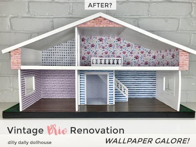
The wallpapers for this Brio comes from this lovely watercolor pattern collection. Since it was made by a graphic designer that knows more than I do about designs and aesthetics, I’m confident that the patterns would go well together. This visual cohesiveness is especially important to me, since in real life we see all the rooms of a dollhouse at the same time.
If you missed it, here are the “before” pictures and the exterior makeover of this Brio renovation.
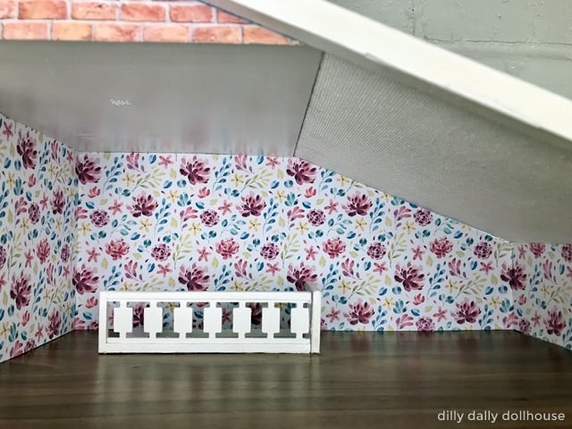
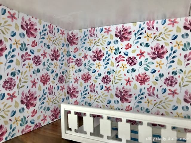
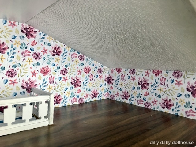
The most prominent room of the house should get our favorite wallpaper. I’m a sucker for floral patterns so that’s my choice for the upper main room. This particular pattern has all the colors of the other patterns, which helps tying the whole look together.
For lower main room, I installed the stripes pattern just on the back walls facing forward. There is a reason for this. You see, this room has lots of corners to accommodate the stairs and bathroom, i.e. it’s not a simple, square room. The combination of the many corners and the high contrast of the wallpaper pattern could make a room look overwhelmingly busy. So I balanced it out with painting the side walls white.
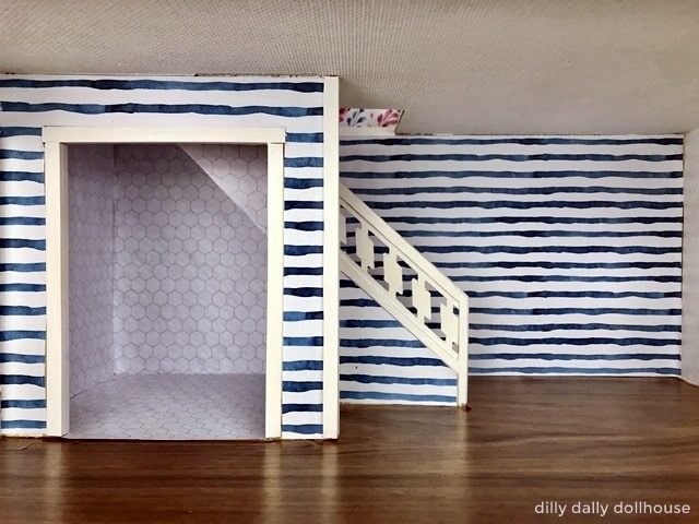
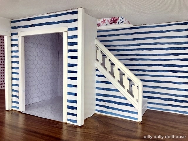
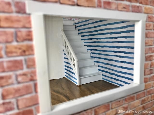
Actually, I couldn’t figure out how to cut out the paper around the end of the stair railing, that’s why I ended up painting the side walls. The whole balancing-the-busyness in previous paragraph was just an excuse–LOL.
The kitchen gets a warm color. Or, the warmest color available from this particular collection.
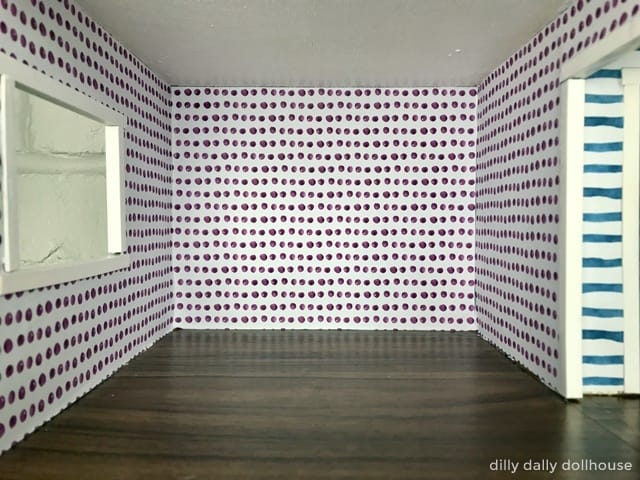
The bedroom feels “meh” to me right now. I may add black side walls to add some drama and contrast.
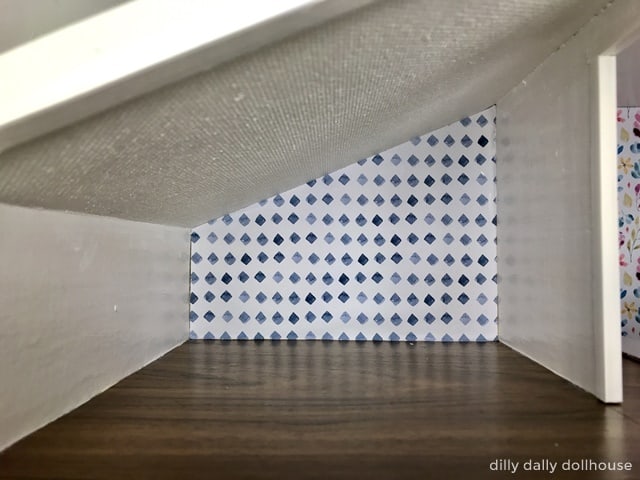
The bathroom
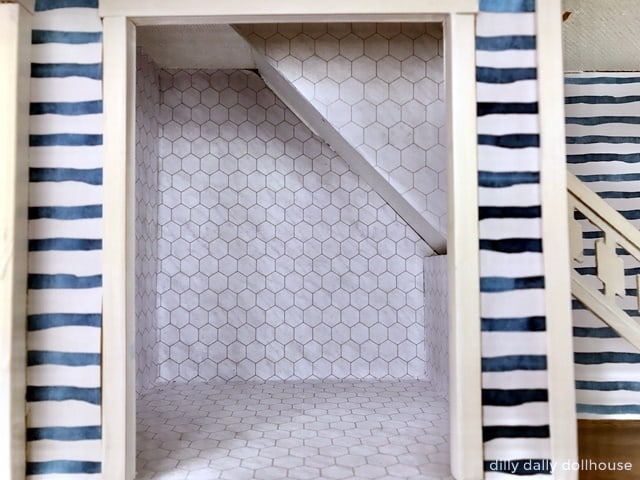
Boy, was I glad when the bathroom was done! My favorite feature of the Brio dollhouse turned out to be the biggest challenge in this renovation. There are many angles to measure, and not enough space to accurately do so. When all the papers have been cut and re-cut and glued on, it was difficult to photograph the results. I was pretty happy with it, though. This is the free marble tile pattern that I used.
Floors and Ceilings
If you follow me on Instagram, you probably already know that I use dark-wood contact paper for the floors. The ceilings got an allover white acrylic paint.
And next?
Just before finishing, my daughter asked for a dollhouse for her Calico Critters (aka Sylvanian Families). So this Brio will house the critters for a while.
By the way, the house’s name is Bowie, in honor of the bowed wall that I didn’t fix decided to embrace.
I’m sure I’ll be making more minor improvements in the future. Just like a house, is a dollhouse is ever really “done”?

I love how it turned out. You will have to share a picture with it decorated and your daughters critters. I am working on an Ikea dollhouse for my daughters calico critters right now. So much fun!
Thanks Kristyn! I will 🙂
Ikea dollhouse is perfect for Calico Critters too ❤ Would love to see it when you’re done